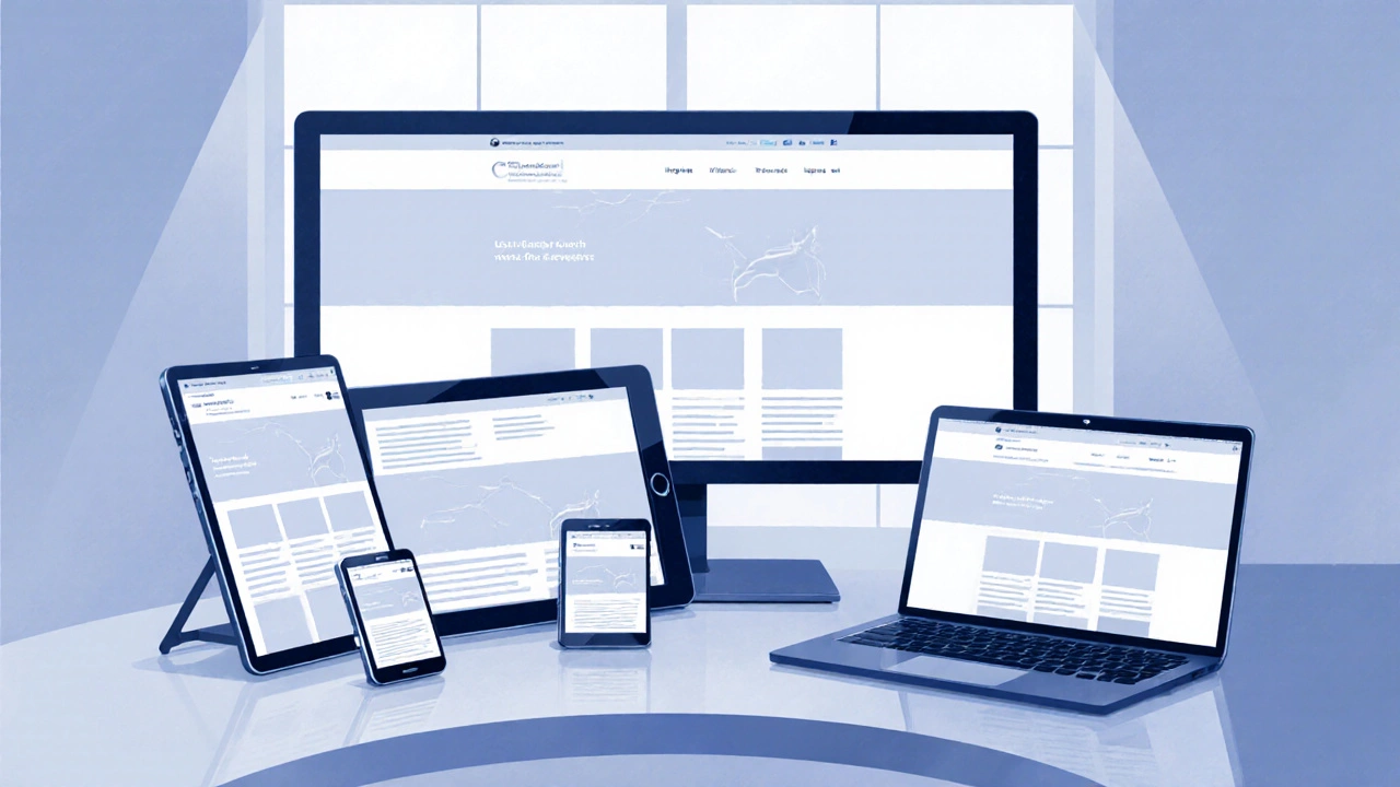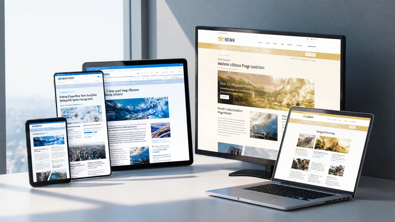
Alright, so you're probably curious about what makes a website adjust beautifully, whether you're on a giant desktop monitor or just scrolling on your phone. It's not magic—it's responsive web design! So let's jump into the three essentials you need for it to work like a charm.
First up, flexible grids. Think of your website layout as a kind of modular playset. Flexible grids let elements resize like pro jigsaw pieces, making sure your content stays neat and legible, no matter the screen size. You're using percentages instead of fixed units—it's like fitting the same furniture in both a tiny apartment and a sprawling mansion.
Next, responsive images. What good is a stunning image if it won't show correctly on a small screen? With responsive images, you make sure those visuals load lightning-fast, no blurry messes, and perfectly scaled for every device. It's also kind of a wizardry with CSS and HTML5 features that makes graphics as adaptable as a good pair of jeans.
Flexible Grids
Let's start with something that might sound a bit technical but is genuinely the bread and butter of responsive web design—flexible grids. Picture this: you're designing a website, and you need it to look fantastic whether it's on a massive desktop screen or a teeny mobile phone. This is where flexible grids swoop in to save the day.
The Basics
So, how do these grids work? Instead of sticking rigidly to pixel-based measurements, flexible grids use relative length units like percentages. This way, elements on your web page resize in relation to the screen size. It's as if every part of the page is a tiny shape-shifter, adjusting itself for the perfect balance of space.
Here's a simple example: if you set a column's width to 25%, it doesn't matter if the viewport is 320 pixels wide or 1920 pixels wide, the column will always take up a quarter of the space.
Setting Up Flexible Grids
To put this into practice, try using a CSS technique known as 'fluid grid layout.' It involves calculating proportional widths for columns and containers. To calculate: divide the target element by the context. If you want to keep math simple:
- Target Width: The width of the item.
- Context: The container or parent element width.
Example formula: (target ÷ context) × 100 = % of target. This formula helps create a layout that expands and contracts efficiently.
Why You Should Care
Trust me, applying flexible grids ensures your site has the adaptability it needs. No one's going to stick around a web page that forces them to pinch and zoom until their fingers cramp up. In today's world, with so many variations in screen sizes, it's crucial to nail this.
A Snap with CSS Frameworks
If math isn't your thing, don't stress—many CSS frameworks, like Bootstrap, offer pre-built grid systems that do a lot of the heavy lifting for you. They can save you tons of time while making sure your website stays both responsive and stylish.
So, when working with websites, never underestimate the power of flexible grids. They might just be the secret sauce to making your site flexible enough to handle whatever device the visitor is using.
Responsive Images
You know how annoying it can be when an image takes forever to load and messes up your browsing experience, right? That's where responsive images come into play. This part of responsive web design ensures your images look sharp and load quickly on any device. No more squinting to make out details or waiting for ages for them to pop up.
Responsive images aren't just about resizing. They're about using the right image for the right context. This doesn't just benefit users—Google loves fast-loading sites, so your SEO game gets a nice boost too!
Use Different Image Sizes
One neat trick is using CSS to swap out images according to the screen size. Here’s an example technique: the srcset attribute. It lets browsers choose the best image source depending on the user's display—kinda like picking the perfect-sized TV for your room.
Optimize Image Format
JPEGs work great for colorful images with complex patterns, but formats like WebP and AVIF give you higher quality at smaller sizes. These are next-gen formats, and they're super efficient for smaller file sizes and faster loading times.
Keeping File Sizes in Check
No one likes bulky files slowing things down. Using tools like ImageMagick or online services like TinyPNG helps cut out the unnecessary bloat from your images without sacrificing quality. It's all about maximizing speed and efficiency.
Adaptive Serving
This technique involves calculating the user's device bandwidth and only serving images fit for that bandwidth. It’s smart and resource-efficient, ensuring that users only get what their connection can handle.
By putting these strategies into action, you're not just making your site look good—you're making it way more functional and user-friendly across various devices. So, when it comes to responsive images, a little adjustment can go a long way in creating a stellar browsing experience.

Media Queries
If you've ever wondered how websites seem to magically fit all kinds of screens with ease, media queries are the secret sauce. They're a core ingredient in responsive web design, allowing different styles to be applied based on the user’s device characteristics like screen size, orientation, and even resolution. It's like getting a tailored experience every time.
How Do Media Queries Work?
Media queries apply different styles to different conditions. Think of it as your website's way of checking its surroundings before deciding on its appearance. You write CSS rules that kick into action only when certain conditions—called 'breakpoints'—are met. This is how your desktop and mobile display can both look sleek and intentional.
- Breakpoints: These are the specified conditions, like when the screen width is 600px or less.
- Syntax: It starts with @media, followed by the condition and then the CSS rules.
Here's a basic example: @media (max-width: 768px) { body { font-size: 14px; }} means when the screen width is 768 pixels or narrower, the body text gets smaller. Simple yet powerful!
But what about those fancy 4K monitors? Media queries can handle it! You can create high-resolution media queries to accommodate these too.
Common Uses and Tips
Now, let's talk about putting these bad boys to work:
- Start small and build up. Unless your main audience is desktop users, design for mobiles first. This is often more efficient and captures more users who browse on-the-go.
- Organize by breakpoint. Keep your media query styles organized, either grouped together or placed close to the related CSS rules for easy maintenance.
- Don't go overboard. Too many breakpoints can complicate things. Find those sweet spots for the most seamless experience.
Here's a nugget: By the end of 2023, mobile devices made up roughly 55% of global website traffic. That’s where media queries show their importance, letting you create an inclusive design that works no matter how your audience gets there.
Practical Tips for Implementation
Alright, now let’s get down to the nitty-gritty of actually making your website responsive. It might feel a bit daunting at first, but don’t worry. With the right approach, you’ll get there.
Create a Flexible Grid Layout
It all starts with the grid. Ditch the fixed pixel sizes and opt for a fluid grid. This means using relative units like percentages for your columns, margins, and widths. A nifty trick is to divide the target element by its context to get a percentage. For example, if your sidebar is 300px on a 1000px page, it becomes 30%.
Make Sure Images Are Responsive
To get those responsive images in shape, you need to ensure they scale correctly. Use the CSS rule max-width: 100%; to make images shrink within their container but never grow beyond their actual size. This ensures a seamless display on both massive screens and tiny ones.
Use Media Queries Smartly
Media queries are your best buddies. Set breakpoints where your layout needs to change to keep the design consistent and functional. The trick here is to design mobile first because desktops can handle more complexity. Typical breakpoints might be for screens smaller than 768px for tablets or 480px for smartphones.
Optimize Your Content
Your content needs to be concise. Remember, people on the move don’t have the patience for endless scrolling. Break long articles into smaller headings or lists to make them digestible.
Testing and Validation
Finally, test your design on various devices. Use browser dev tools or online tools to emulate different devices and see how your site behaves. It’s all about spotting those hiccups early on.
To sum up: Create a flexible grid, make your images responsive, utilize media queries wisely, keep your content smart, and test like a pro. You follow these steps, and your responsive web design will be top-notch!