TreeMap Chart: A Data Visualization Technique

Treemap
Treemapping is a data visualization technique that is used to display hierarchical data using nested rectangles. Also, The treemap chart is created based on this technique of data visualization. Here, Charting facilitates the desired analysis only when data is usually visualized on the right type of chart.
Introduction
It is utilized for representing hierarchical data in a tree-like structure. Here, Data is organized as branches and sub-branches. Further, it is represented using rectangles. Based on the quantitative variables associated with each rectangle, The dimensions and plot colors of it are calculated. Here, each rectangle represents two numerical values. Also, You can drill down within the data to, theoretically, an unlimited number of levels if needed. So this makes it an at-a-glance snapshot distinguishing between categories and data values very easy.
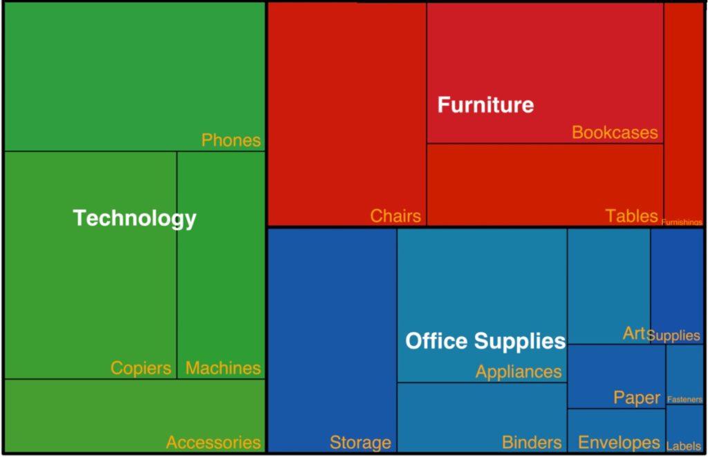
Now, Let’s Take a look at the chart sample shown below:
If in case you’ve worked with data visualization extensively, you’d know that this varies not just the only the basis of your data. but it also depends on the kind of analysis you want to facilitate.
Ideal use cases for a Treemap
Like every other chart type and data visualization technique, It work well only if it can be used in situations that justify its use case. Now, Let’s take a look at what are the ideal use instances that warrant the use of a treemap:
1. Studying of data w.r.t two quantitative values
The data which you have needs to be analyzed w.r.t 2 quantitative values. Here, Each rectangle (node) in the treemap showcases the values for two quantitative values. Like said above, the measurements of the rectangles in the sample treemap (above) represent the models sold for a model in the current year. And, the color represents the development in sales w.r.t the previous year sales.
2. A large amount of hierarchical data but with a space constraint
For suppose, You have a very large amount of hierarchical data and a space constraint. In this case, Treemap are equipped to be able to plot more than tens of thousands of data points. There are other charts that can be used for plotting hierarchical data. Two charts that quickly come to mind are and the drag-node chart & multi-level pie chart. However, these charts present an area constraint as the number of data points increases beyond a certain limit. Additionally, the multi-level pie chart is definitely circular while the treemap can be linear. Therefore, a linear chart is certainly easier to read and understand than a circular one.
3. To identify the trends and patterns between the node
Do you like to see high-level summary data of anomalies & similarities within 1 category as well as between 2 groups?. Then, based on the numerical values assigned to each node, The dimensions and colors of the rectangles (nodes) in a treemap are configured. So this makes it easy to identify the trends and patterns between the nodes of all the classes plotted on the chart as well between your nodes of a single category. For example, Honda-manufactured bikes have done better in the Street category than in any other category.
4. For detailed study & representation of data
Your data can be organized at several amounts. Here, Treemap charts support the drill-down feature. Tree chart users can simply drill down to do a detailed study of data at many granular levels.
5. To showcases data in a better & meaningful way
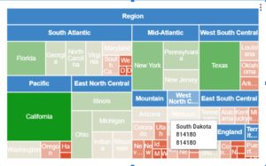
For example, It showcases region-wise literacy rates and population predicated on the info collected for a period of one year. Here, The size of each rectangle represents the population, the color represents the literacy rate.
Limitations of a Treemap
The treemap poses the following limitations:
1. You cannot display data that varies in magnitude.
2. Out of the two quantitative variables that a rectangle represents, the variable standing for the size of the rectangle cannot have a negative value.
3. From the area of the rectangle, one of the values a rectangle stands for is to be gauged. In fact, this is slightly difficult when compared to other charts where you can gauge values from the length of the data plot.
4. Within the parent node of treemap charts, the rectangles are automatically ordered by area. It does not provide for any more sorting options.
5. Treemaps having a large number of data factors on a single level are very unsuitable for print.
6. Treemap charts need a significant amount of effort when you are creating one. However, once you’ve figured them out, then there aren’t many charts that can pack as much a punch as these charts for showcasing hierarchical data.
Advantages of Tree Map
A tree map is an excellent way to visualize data. It helps people understand complex information more easily. Tree maps are great for visualizing large amounts of data in a simple format. They’re also useful for comparing different variables.
In this article we will discuss some advantages of using tree maps.
Tree maps are very easy to use and understand. You can quickly see how each variable affects the others. This makes them ideal for visualizing large amounts data.
Visualizing Data Easily
Tree maps are also very effective at helping people understand complex information. They help people understand relationships between variables by showing lines connecting the nodes. These lines show the relationship between two variables.
Easy to Understand
Tree maps are easy to understand because they use simple shapes to represent different categories. This makes them easier to read than other types of charts.
Can Be Used as a Tool for Decision Making
Tree maps are used by decision makers to make decisions. They help people see how one thing affects another.
Can Help You Find Patterns
Tree maps are also helpful when you need to find patterns in large amounts of data. If you’re looking at a lot of numbers, you might not notice trends unless you use a tree map to help you spot them.
5 Reasons To Use A TreeMap
A tree map is an effective way to organize information visually. It’s also a great tool for visual learners. Here, we’ll show you five reasons why using a tree map is better than a traditional table.
You Can Easily Add More Data.
If you’re looking for a more flexible data visualization solution, then a tree map might be right up your alley. With a tree map, you can easily add more data by simply adding new rows and columns. This makes it easy to visualize large amounts of data.
You Can Sort By Any Column.
Another benefit of a tree map is that you can sort any column. So if you wanted to see how much revenue each product generated, you could do so with just one click.
You Can Hide Unwanted Rows.
If you’re looking to make your data more readable, you can hide rows by clicking on the “Hide” button at the top right corner of the row. This will remove the row entirely from the view.
You Can Show Multiple Levels Of Hierarchy.
Another advantage of using a tree map is that you can show multiple levels of hierarchy. For example, you can display the parent/child relationship between two nodes.
You Can Create Custom Views.
If you’re looking for a more flexible solution, you can use a tree map to create custom views. This means that you can add new columns and rows at any level of the tree.
10 Amazing Uses of Tree Maps
Tree maps are a great way to visualize large amounts of information in a simple and intuitive manner. Tree maps are an amazing way to visualize data. In this article, we’ll show you ten ways to use tree maps. Here are ten examples of how to use tree maps.
Visualizing Data with Tree Maps
Tree maps are a visual representation of hierarchical data. They’re used to display information in a tree structure where each node represents one piece of data. Each branch represents a relationship between two nodes.
Using Tree Maps as a Tableau Alternative
Tree maps are a visualization technique that’s similar to bar charts, line graphs, and pie charts. You can use them to represent any type of data, such as numeric values, percentages, ratios, and more.
Creating Interactive Tree Maps
To make tree maps interactive, you need to add some interactivity to the map itself. This means adding clickable areas to each node (the area where the branches meet). These areas will allow users to navigate through the tree map by clicking on different parts of the nodes.
Building a Tree Map from Scratch
If you’re looking to build a tree map from scratch, there’s no better place than Google Sheets. You can start with a blank sheet and then populate it with data using formulas. Once you’ve got your data set up, you can easily add interactivity to the map.
Adding Textual Information to Tree Maps
One of the easiest ways to add textual information to a tree map is by adding labels to each node. To do so, click on the “Labels” tab at the top of the spreadsheet. Then, select the type of label you’d like to use (e.g., text, number, color) and enter the desired text.
5 Unique Uses of Tree Maps
Tree maps are an effective way to visualize data. They’re also great for visualizing hierarchies. Here will show you how to use tree maps in your next project. It includes examples of using tree maps to visualize hierarchical data, and to create a map that shows relationships between different categories.
Here’s how to use them effectively.
In this article we’ll show you five unique uses of tree maps. We’ll start with a simple example of showing the hierarchy of a company structure. Then we’ll move onto more complex examples where we’ll show how to use tree maps to visualize hierarchies, and to create a tree map that shows relationships between categories.
Visualize Hierarchical Data.
A tree map is a type of diagram used to represent hierarchical data. It’s similar to a flow chart, except that instead of using arrows to indicate directionality, it uses branches to show parent/child relationships.
Create a Hierarchy Map.
Tree maps are a great way to visually display hierarchies. You can use them to illustrate any kind of hierarchy, such as a family tree, a company structure, or even a social network.
Show Relationships Between Items.
A tree map is a type of diagram used to show relationships between items. It’s often called a “tree” because it looks similar to a tree with branches and leaves.
Display Multiple Levels of Information.
Tree maps are a good way to display multiple levels of information. This makes them ideal for showing how different parts of a system interact with each other.
10 Tips for Making the Most Out of Your Tree Map
A tree map is an effective way to visualize data. It’s also a great tool for visualizing complex data sets. A tree map is a type of diagram that helps people understand large amounts of information by breaking it down into smaller pieces.
Here are some tips for making the most out of this powerful visualization technique.
Make sure you use a good quality image. 2. Don’t make the nodes too small. 3. Try not to make them too big either. 4. You should try to keep the number of nodes per level between 5 and 15. 5. If you need more space, consider using a different layout. 6. Consider adding labels to each node. 7. Add arrows to indicate relationships. 8. Be careful when choosing colors. 9. Keep the size of the text within each node proportional to its importance. 10. Remember to add a legend.
Start with a clear goal.
Before you start creating your tree map, think about what you want to accomplish. What do you hope to learn? How will you use the results? Do you want to understand how people interact with your product? Or perhaps you just want to see where your competitors are strong and weak. Whatever your goals are, make sure you clearly define them before you begin.
Choose a color scheme that works for your audience.
Once you’ve decided on your goal, choose a color scheme that makes sense for your audience. If you’re trying to sell something, then blue might work well because it’s associated with trustworthiness. On the other hand, if you’re trying build awareness for a new service, green might be more appropriate.
Add labels to help users understand what each node represents.
You can use a tree map to show how different parts of your business relate to one another. This helps people understand how your products fit together and how they can interact with one another.
Include a legend or other explanation when necessary.
If you’re using a tree map to explain something complicated, make sure to include a legend or other explanation. Otherwise, people will struggle to figure out what each part of the chart means.
Create A Tree Map Using Excel
Create a tree map in Excel by following these steps. In this tutorial, we’ll show you how to create a tree map using Excel.
Start with an empty spreadsheet.
Select the cells where you want to place the nodes.
Add columns to organize data.
To add a node, click anywhere within the cell. Then drag the mouse to draw a rectangle. You can also use the arrow keys to move the cursor. Click again to select the new node. Repeat these steps until you’ve added all the nodes you need.
Sort data by column.
Once you’ve finished adding nodes, sort the rows by clicking the header row and then pressing Ctrl+S. This will put the nodes into alphabetical order.
Select cells and copy them into another sheet.
Now select the entire column and press Ctrl+C. Then go back to the original sheet and paste the data into a new column.
Paste values into new rows.
Next, click on Insert > Chart > Tree Map. You will see a dialog box with options to choose from. Choose the first option and then drag the columns to make them appear as branches. Finally, add labels by clicking on each cell and typing out the name.
Tree Map Interesting Facts
The term “tree map” refers to a type of diagram that shows how different parts of a system relate to each other. It’s often used in business and economics to show relationships between people, products, services, and so on. Discover some fun facts about tree maps!
The first known use of a tree map was by Leonardo da Vinci in 1490.
In fact, tree maps were invented by Leonardo da Vinci, who called them “the universal language of nature.” He used them to illustrate his ideas about human anatomy, botany, geology, and astronomy.
In 1842, Charles Darwin used a tree map to illustrate his theory of evolution.
Today, tree maps are still widely used to show relationships between different things. They’re also used to represent data visually, such as when you see a bar chart with bars arranged vertically instead of horizontally.
A tree map is also called a dendrogram or cladogram.
In addition to showing relationships between different things, tree maps can also be used to show how similar two items are. This is done by arranging them next to each other so that they form a branching pattern.
You can create a tree map using Microsoft Excel.
To make a tree map, start with an empty spreadsheet. Then add columns for the categories (e.g., “Fruit”) and subcategories (e.g., apples). Next, sort the data into rows based on category and then arrange the rows in order of similarity. Finally, color code the cells according to the value of the cell.
There are many different ways to display data on a tree map.
You can use any type of chart to represent data as a tree map. Here are three examples:
1. A bar chart shows how much each category contributes to the total.
2. A pie chart shows what percentage of each category makes up the whole.
3. A line graph shows the relationship between two variables.
The Disadvantages of the Tree Map
A tree map is an effective way to visualize data, but there are some disadvantages to using one. Find out what they are!
A tree map is a visual representation of hierarchical data that helps people understand relationships between items. It’s also useful for organizing information in a way that makes sense to humans.
You Can’t See All Data at Once.
If you’re looking at a large dataset, such as a spreadsheet with hundreds of rows and columns, it might be difficult to see how each row relates to every other row. This is where a tree map comes in handy.
You Have to Sort Through Lots of Information.
A tree map is a visual representation of a hierarchical structure. It shows relationships between different parts of a dataset by connecting them with lines. Each node represents a group of related items, while the branches represent the relationship between those groups.
You Need to Know Which Kind of Chart Is Best For Each Situation.
There are two main kinds of charts: bar charts and line graphs. Bar charts show how much each item contributes to the total value. Line graphs show trends over time. Both are very helpful when analyzing data, but there are situations where one kind of chart works better than another.
There’s No Way To Add or Remove Items From a Tree Map.
If you’re trying to compare the size of different groups, then a bar chart will work well. However, if you’re looking at the relationship between items, then a line graph might be more appropriate.
You Can Only Show One Level Of Detail At a Time.
In a tree map, each node represents a group of data points. Each branch represents a subgroup within that group. So, when you click on a node, you’ll see all the nodes below it. This means that you can only show one level of detail at a time.
Conclusion
Therefore, To represent hierarchical data in a tree-like format, always use Treemap charts. Usually, in Treemaps, Data is always organized as branches & sub-branches. Further, Parent-child hierarchies can be represented in an efficient way by using elements of treemap & they are readily organized.

hey, it is good source of info on treemap charts
![Bubble Chart [Scatter Chart]](https://auniqueweb.in/wp-content/uploads/2019/08/Bubble-Chart-Scatter-Chart.jpg "Bubble Charts – 5 Top Interesting FAQs")

