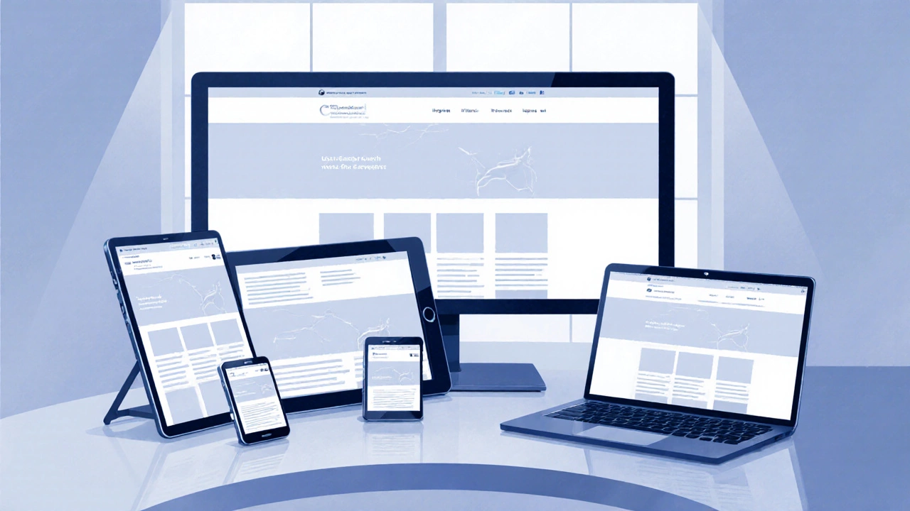
Ever opened a website on your phone and had to pinch, zoom, and swipe sideways just to read a sentence? Frustrating, right? That's where responsive web design comes into play. It's like having an elastic website that adapts to whatever device you're using, whether it's a smartphone, tablet, or desktop. So, why is this a big deal?
First off, let’s talk reach. Over half of global web traffic now comes from mobile devices. Yeah, you read that right. If your site isn’t mobile-friendly, you might be missing out on a massive chunk of potential visitors. Responsive web design solves that by making sure your website looks great and functions well no matter the screen size.
- What is Responsive Web Design?
- Why Mobile Matters
- The SEO Benefits
- Cost and Time Efficiency
- User Experience and Engagement
- Tips for Implementing Responsive Design
What is Responsive Web Design?
So, what exactly is responsive web design? Think of it as crafting a website that bends and folds itself to fit any screen size. It's all about using fluid grids, flexible images, and CSS media queries. This design revolution isn't just about shrinking things down; it’s about making sure your site looks sleek and functions well on every device from a pocket-sized smartphone to a widescreen desktop monitor.
Before the rise of responsive web design, developers used to build separate sites for mobile and desktop. It was like having two businesses sewn together, except both required separate maintenance and updates. Responsive design waves goodbye to that hassle.
How Does It Work?
At the core of responsive web design are flexible grids and layouts. Instead of setting fixed widths, designers use relative measurements like percentages to let elements reshape on the fly. Also, CSS media queries play a vital part by applying different styles depending on screen size. Essentially, they’re the style rules that determine how the design adjusts.
Why Stick With Responsive?
- Saves Time & Cost: No need for multiple versions of your site.
- Improves User Experience: A consistent look and feel across all devices keeps users happy.
- Boosts SEO: Search engines favor sites that are mobile-friendly.
With the internet's wild growth, almost everyone has multiple gadgets, making responsive web design more crucial than ever. A website that's got the flexibility to handle varied screens can make or break your visitors' experience.
Why Mobile Matters
So, why all the fuss about making websites mobile friendly? Well, let’s start with some hard-hitting facts. More than half of internet users globally access the web through their phones. That's no small number. We're talking around 55% of all web traffic. Crazy, right?
For businesses, this means potential customers are most likely browsing via their smartphones. If your site doesn’t function well on mobile, you’re risking a lot of lost traffic. A responsive web design ensures you capture these visitors by adjusting the site’s layout and functionality to fit their screens.
Think User Experience
Nobody wants to deal with a clunky site that requires zooming in and out. If navigating a website feels like solving a puzzle, users will just bounce. User experience plays a crucial role in keeping visitors engaged, and responsive design enhances this by making sure everything looks just right, no matter what device you’re using.
Fast Loading Speeds
Did you know mobile users are less patient? They expect sites to load in about 3 seconds or less. A responsive web design optimizes load times, ensuring visitors stick around longer, which can lead to higher conversion rates.
Get Noticed by Search Engines
Google’s algorithms love mobile friendly sites. Since 2015, Google has given preference to responsive web design in search results on mobile devices. So if you want better visibility, going responsive is pretty much a no-brainer.
The SEO Benefits
You might be wondering how responsive web design can boost your SEO game. Well, it's got some pretty neat advantages that search engines like Google absolutely love.
First off, from a technical standpoint, having a mobile friendly design means you only need one URL for your site. This makes it way easier for search engines to crawl and index your pages. Instead of dealing with multiple versions of your site (like a desktop and a mobile version), search engines get all the info in one place, giving your site a unified, credible web presence.
But that's not all. Google has been pretty clear about rewarding web development practices that enhance the user experience with better rankings. And since mobile-first indexing became a thing, Google primarily looks at the mobile version of your site for ranking purposes. So, if your site isn’t responsive, you could be harming your SEO score.
Lower Bounce Rates
Ever see a high bounce rate and wondered if it hurt your site’s SEO? It does. A responsive site helps keep users engaged longer by delivering content that looks good and is easy to access no matter the device. Engaged users are less likely to bounce, which keeps your site’s SEO in good shape.
Page Load Speed
Speed is crucial. Google highlights loading time as a ranking factor. Responsive designs are often optimized for performance, meaning faster load times, especially on phones. And faster sites rank better. Simple as that.
When thinking about your site’s future, consider this: The easier visitors can navigate it, the better it performs on search engines. Plus, with the rise in mobile usage, a responsive web design isn’t just nice, it’s necessary.

Cost and Time Efficiency
Let's face it, building separate sites for desktop and mobile is like planning two weddings at once—complicated, costly, and time-consuming. That's where responsive web design becomes a total game-changer. By creating a single site that works well on any device, you're effectively cutting your work in half.
Why spend double the resources when one site can do the job? Think of it this way: you’re designing one responsive template that adapts to any screen size seamlessly, which means fewer headaches for developers and less stress over ongoing maintenance. It’s like hitting a home run in your first swing.
Unified Maintenance
With traditional design, every change means updating multiple sites. That’s a hassle, right? A responsive design saves time because tweaks and updates are applied across the board, automatically adjusting for all devices. Imagine fixing a bug once and having it resolved everywhere. It’s basically maintenance nirvana.
Investment That Pays Off
Sure, the initial cost of implementing responsive web design might be higher, but it’s an investment that keeps on giving. Avoiding the need to develop and update separate sites means you save money long-term. Plus, a single website is easier to manage, and less management usually means a lighter budget. Money saved is money earned.
| Development Approach | Initial Cost | Maintenance Cost |
|---|---|---|
| Separate Sites | High | High |
| Responsive Design | Moderate | Low |
In short, when it comes to cost and time, responsive web design is your best buddy. Not only does it make everything simpler, but it also ensures you’re not throwing cash and time down the drain keeping up with multiple sites.
User Experience and Engagement
User experience is the name of the game when it comes to digital design. You want visitors to hang out on your site, feel comfortable, and not run for the hills after their first click. With responsive web design, you’re ensuring that users have a smooth and enjoyable interaction with your site, no matter what device they’re using.
Picture this: a seamless transition from a computer screen to a phone screen. No annoying side-scrolling, no difficult-to-read text. That's what mobile friendly design is all about. Users can find what they’re looking for quickly and easily, which in turn boosts engagement. People just love it when things 'just work'.
Faster Loading Times
Ever bounced from a site because it took forever to load? You're not alone. Slow loading times can drive users away faster than you can say 'bye'. Responsive design improves load times by optimizing the website's resources to fit the device. When pages load faster, users stick around longer.
Consistency Across Devices
Consistency is crucial. By having a responsive web design, your website offers a consistent experience across all devices. This means that whether someone is visiting from a laptop in a café or a smartphone in a subway station, your brand message remains clear and coherent.
Boosting Engagement Rates
Interactive elements are easier to use on a site that’s responsive, too. Envision a contact form that’s hard to fill out on a mobile device due to poor layout. Users get frustrated and leave. A well-designed responsive layout makes engagement effortless, turning visitors into loyal followers.
Table of User Stats
For those who love some solid numbers, here’s a quick glimpse:
| Metric | Percentage |
|---|---|
| Mobile Traffic 2024 | 55% |
| Improved User Experience | 72% |
| Bounce Rate Decrease | 25% |
Wondering how to take your website from 'meh' to 'wow'? It’s worth investing the time in responsive design. Not only will it make your life as a web developer easier, but your users will thank you by sticking around longer. And that, my friend, is what engagement is all about.
Tips for Implementing Responsive Design
Jumping into responsive web design might seem a bit daunting at first, but trust me, it's worth the effort. There are some tried and true tips you can follow to make sure your website looks and performs great across all devices.
Start with a Mobile-First Approach
Designing for mobile first means starting with the smallest screen size and working your way up. This approach ensures your site loads fast and looks good on phones, then scales up in complexity for larger screens. It's a nifty way to address the biggest audience right away.
Use Fluid Grid Layouts
Responsive web design is all about flexibility. Fluid grid layouts allow elements to take up a relative percentage of the screen, rather than a fixed number of pixels. This ensures everything scales properly across different devices.
Optimize Images and Media
Images can be a major pain point if they're not scaled properly. Use responsive images that adjust based on the viewer’s screen size. Consider using the srcset attribute on images to specify different sizes for different devices, keeping load times snappy.
Leverage CSS Media Queries
Media queries are your go-to tool for applying different styles at various screen widths. By creating breakpoints, you can ensure your site maintains its hierarchy and usability across all mobile-friendly devices.
Test, Test, Test
You've built it, but will they come? More importantly, will it work when they do? Test your website on as many devices and browsers as possible. Tools like Google's Mobile-Friendly Test are a great way to identify glaring errors.
By following these tips, you’ll be well on your way to crafting a site that’s not only mobile friendly, but also engaging and accessible. In today's digital age, that’s the kind of edge you can't afford to miss.