
Bootstrap Breakpoint Calculator
Calculate Bootstrap Breakpoint
Enter a viewport width (in pixels) to see which Bootstrap breakpoint it corresponds to and what classes you'd use.
When you hear "Bootstrap," the first thing most developers think of is a framework that makes sites look good on any screen. But is it truly Bootstrap responsive, or does it also give you adaptive behavior? This article breaks down the difference, shows exactly how Bootstrap works, and helps you decide when you need pure responsiveness or a mix of adaptive tricks.
Key Takeaways
- Bootstrap is built on a responsive, mobile‑first grid that uses CSS media queries.
- Adaptive design relies on fixed layouts or server‑side device detection, which Bootstrap does not provide out of the box.
- You can combine Bootstrap’s responsive core with custom adaptive techniques if you need pixel‑perfect control.
- Choosing between responsive and adaptive depends on project goals, target audience, and performance constraints.
First, let’s clear up what “responsive” actually means.
What is Responsive Design?
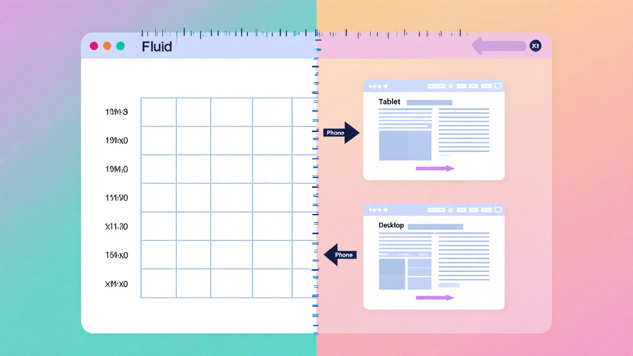
Responsive design is a design approach that makes a web page automatically adapt its layout to the screen size, orientation, and resolution of the device using fluid grids, flexible images, and media queries. In practice, you write a single set of HTML and CSS, and the browser rearranges elements based on breakpoints you define. The result feels natural on a phone, tablet, or desktop without any extra code.
What is Adaptive Design?
Adaptive design is a strategy that serves distinct layouts for specific device categories, often detected via server‑side logic or JavaScript, and then loads the appropriate HTML/CSS bundle. Instead of fluidly shifting, the page jumps between fixed layouts (e.g., one for smartphones, another for tablets, another for desktops). This can give tighter control over design, but requires more maintenance and may affect load speed.
How Bootstrap Implements Responsiveness
Bootstrap is a front‑end framework that provides a responsive, mobile‑first grid system, pre‑built components, and utility classes. The core of its responsiveness lives in three concepts:
- Grid system uses a 12‑column layout where columns are defined in percentages, so they shrink or expand with the viewport.
- Media queries built into the CSS target common breakpoints (xs, sm, md, lg, xl, xxl) and toggle classes like
.col‑md‑6or.d‑none. - Breakpoints are predefined widths (e.g., 576px, 768px, 992px, 1200px) that align with typical device sizes.
Because Bootstrap starts with mobile‑first styling, the base CSS applies to the smallest screens, and each larger breakpoint adds more rules. This flow mirrors how browsers naturally render pages.
Does Bootstrap Offer Adaptive Features?
Out of the box, Bootstrap does not include server‑side device detection or separate HTML files for each device. However, you can achieve adaptive-like behavior by combining its utilities with JavaScript or backend logic. For example, you could load a different navigation component after detecting a high‑resolution tablet, or serve a tailored image set with the srcset attribute based on the viewport size.
In short, Bootstrap is fundamentally responsive, but it is flexible enough to layer adaptive tricks on top if you need them.
Responsive vs Adaptive: Side‑by‑Side Comparison
| Aspect | Responsive | Adaptive |
|---|---|---|
| Core idea | Fluid layout that adjusts continuously | Fixed layouts for distinct device groups |
| Implementation | CSS media queries, flexible grids, percentages | Server‑side device detection or JS, multiple HTML files |
| Maintenance | One codebase, easier updates | Multiple codebases, higher upkeep |
| Performance | Single download, CSS may be larger | Potentially smaller payload per device, but extra detection logic |
| Control | Less pixel‑perfect, relies on fluid rules | Exact control over each layout |
| Bootstrap fit | Built‑in grid, utilities, mobile‑first | Requires custom code on top of Bootstrap |
When to Choose Responsive Over Adaptive (and Vice‑versa)
If your audience uses a wide range of devices and you want a fast rollout, stick with pure responsive design-Bootstrap already gives you the tools. Choose adaptive only when you need precise control for high‑stakes pages (e.g., a product configurator that must look exactly the same on a tablet as on a desktop) and you can afford the extra development time.
Common Pitfalls with Bootstrap’s Responsive Grid
- Assuming the default breakpoints match every device; you may need to add custom
@mediarules for niche widths. - Mixing fixed‑width containers with the fluid grid, which can cause unwanted horizontal scroll.
- Relying solely on column classes without testing the flexbox behavior of Bootstrap’s
.rowand.colelements. - Neglecting the
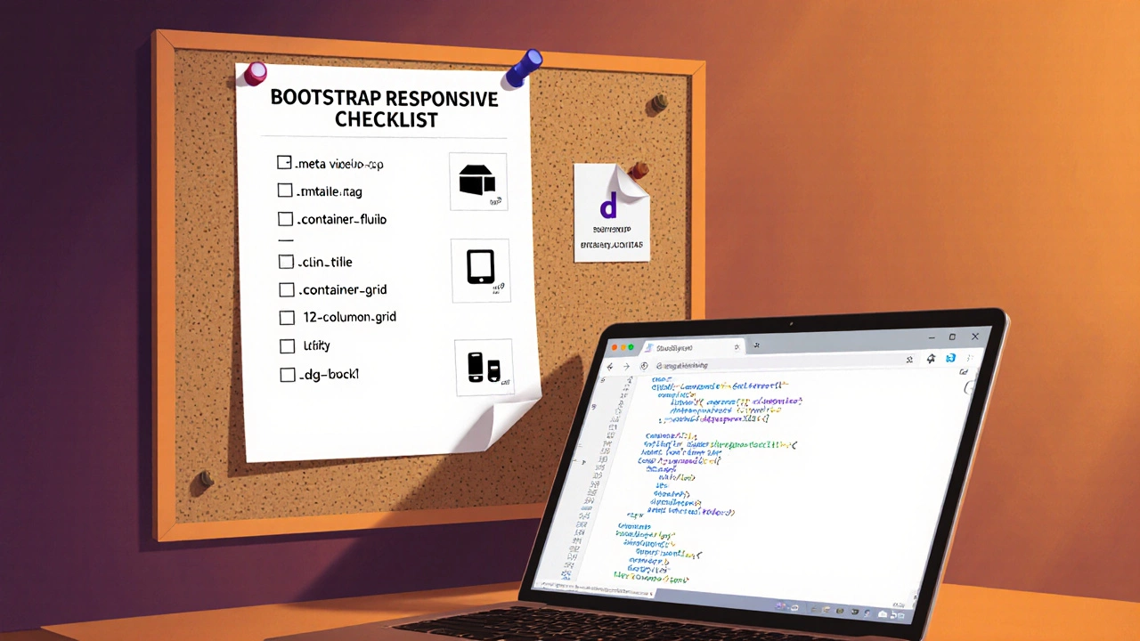
meta viewporttag, which disables the mobile‑first scaling.
Quick Checklist for Building a Responsive Bootstrap Page
- Add
<meta name="viewport" content="width=device-width, initial-scale=1">in the<head>. - Start with a
.container‑fluidor.containerthat respects the viewport. - Use the 12‑column grid system classes (
.col‑sm‑6,.col‑lg‑4, etc.) to define layout at each breakpoint. - Leverage utility classes (
.d‑none,.d‑lg‑block) to show/hide elements as needed. - Test on real devices or with browser dev tools, adjusting custom
@mediaqueries for any outlier widths. - If you need adaptive behavior, add a small JavaScript snippet that swaps components after detecting
window.innerWidththresholds.
Frequently Asked Questions
Is Bootstrap 5 still mobile‑first?
Yes. Bootstrap 5 keeps the mobile‑first philosophy. The base styles apply to the smallest screens, and each breakpoint adds more CSS.
Can I use Bootstrap for a fully adaptive site?
You can, but you’ll need extra code. Bootstrap gives you the responsive scaffolding; for adaptive layouts you must add server‑side detection or JavaScript that loads different templates.
What’s the difference between .container and .container‑fluid?
.container has a max‑width that changes at each breakpoint, while .container‑fluid always stretches to 100% of the viewport width.
Do media queries work without Bootstrap?
Absolutely. Media queries are a native CSS feature. Bootstrap just bundles a set of ready‑made queries for you.
How many breakpoints does Bootstrap define?
Bootstrap 5 defines six breakpoints: xs (0‑575px), sm (576‑767px), md (768‑991px), lg (992‑1199px), xl (1200‑1399px), and xxl (1400px and up).