Tag: web design
May
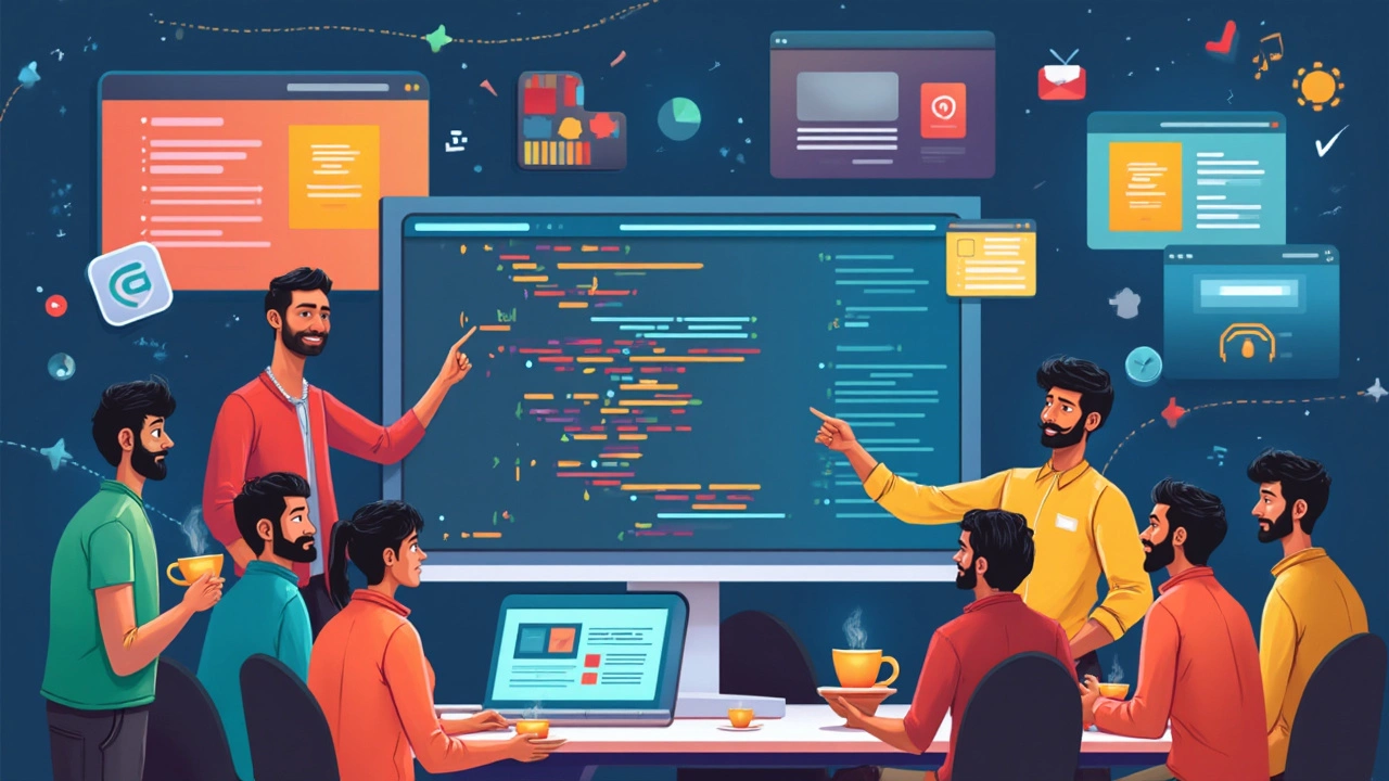
Is CSS a Front End Language? Cutting Through the Confusion
- Jaxon Millwater
- Front End Development
- 0 comment
CSS shapes the way websites look, but there’s always the question—does it count as a front end language? Get a clear answer, plus surprising facts about how CSS works, where it fits in web development, and what makes it so important for modern websites. Find out what sets CSS apart from programming languages and grab a few tips to use it better. Perfect for curious learners and more experienced coders who want to settle the debate once and for all.
VIEW MOREMay

Can I Learn Web Development on My Own? Insider Tips and Real Talk
- Jaxon Millwater
- Web Development Courses
- 0 comment
Tired of being told you need a fancy degree to build a website? Web development is wide open for self-learners. This article uncovers how you can teach yourself web development, which resources actually work, and what challenges you’ll face along the way. You’ll get honest advice, real-world tips, and inspiration to start coding at your own pace—even with zero experience. If you want to go from clueless to confident, you’re right where you need to be.
VIEW MOREMar
Responsive Design Styles Explained: Mastering Web Aesthetics
- Jaxon Millwater
- Responsive Web Design
- 0 comment
Responsive design styles are essential for creating websites that look great on any device. This article dives into the different styles, discussing fluid grids, flexible images, and media queries. Learn how to make your websites user-friendly and visually appealing. Discover tips to optimize design across various screen sizes. Understand responsive design's importance in enhancing user experience.
VIEW MOREDec

Essential Elements of Responsive Web Design
- Jaxon Millwater
- Responsive Web Design
- 0 comment
Responsive design is a crucial aspect of web development, particularly in an era dominated by diverse devices from smartphones to large displays. It ensures that websites automatically adapt their layout and functionality to suit various screen sizes, providing an optimal viewing experience. This means fluid grids, flexible images, and media queries are in frequent play. Responsive design focuses on enhancing user experience, making it a cornerstone of modern digital strategy.
VIEW MORECategories
- Responsive Web Design (13)
- Web Development Courses (11)
- Tech Careers (11)
- PHP Development (10)
- SEO for Web Developers (10)
- UX UI Design (10)
- JavaScript (9)
- Ecommerce Websites (9)
- Web Development Frameworks (8)
- Front End Development (6)
Popular posts
-
Is Learning Web Development in 2024 Still a Smart Career Move?
Jaxon Millwater -
Understanding E-commerce: A Deep Dive Into Online Shopping
Jaxon Millwater -
Integrating SEO into Your HTML Website for Enhanced Visibility
Jaxon Millwater -
Exploring GoDaddy: Is It Your Go-To Hosting Solution?
Jaxon Millwater -
Full Stack Developer Salary with 2 Years Experience: What to Expect
Jaxon Millwater