Tag: CSS media queries
Oct
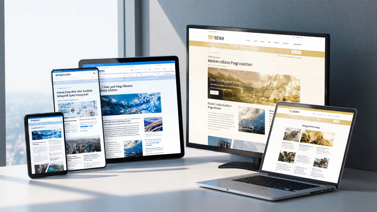
Automatically Make Your Website Fully Responsive on All Devices
- Jaxon Millwater
- Responsive Web Design
- 0 comment
Learn how to automatically make any website fully responsive across phones, tablets, and desktops using CSS, frameworks, and no‑code tools.
VIEW MOREApr

Responsive Web Design: What Really Makes Your Website Responsive?
- Jaxon Millwater
- Responsive Web Design
- 0 comment
Ever wonder why some websites just work on any screen, while others are a mess on your phone? This article breaks down the nuts and bolts of what makes a website responsive. You'll see which tools, tricks, and mindsets make the real difference. No confusing tech talk—just practical info, tips, and real-world advice. Whether you’re starting out or fixing old sites, you’ll find stuff you can actually use.
VIEW MOREMar

How to Convert Your Website to Responsive Design Easily
- Jaxon Millwater
- Responsive Web Design
- 0 comment
Thinking about making your website look great on any device? Converting your site to a responsive design isn't just important; it's a game-changer. This article breaks down practical steps and shares tips to help you transition smoothly, ensuring your visitors can enjoy the best experience possible, whether they're on a smartphone, tablet, or desktop. Find out what tools and techniques can make this process easier and more efficient.
VIEW MORECategories
- Responsive Web Design (14)
- Tech Careers (13)
- UX UI Design (12)
- PHP Development (11)
- Web Development Courses (11)
- SEO for Web Developers (11)
- JavaScript (9)
- Ecommerce Websites (9)
- Web Development Frameworks (8)
- Front End Development (7)
Popular posts
-
Bootstrap: Responsive or Adaptive? Explained
Jaxon Millwater -
Do Web Developers Still Use HTML? Exploring Its Role in 2025
Jaxon Millwater -
Is Python Hard if You Know JavaScript?
Jaxon Millwater -
Exploring GoDaddy: Is It Your Go-To Hosting Solution?
Jaxon Millwater -
Do Ecommerce Sites Make Money? What Really Drives Profit Online
Jaxon Millwater