Media Queries – The Backbone of Responsive Design
When working with Media Queries, a CSS feature that applies styles based on device characteristics such as width, height, orientation, and resolution. Also known as CSS Media Queries, they let developers tailor the look of a page to any screen.
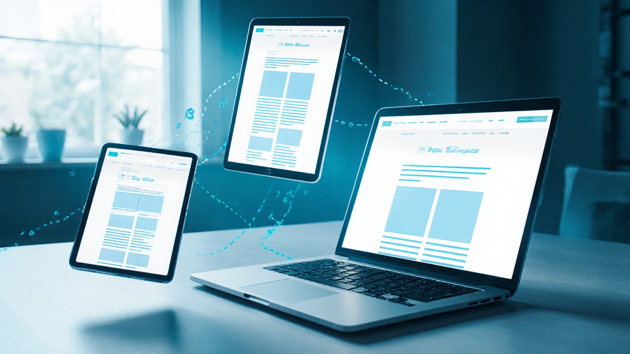
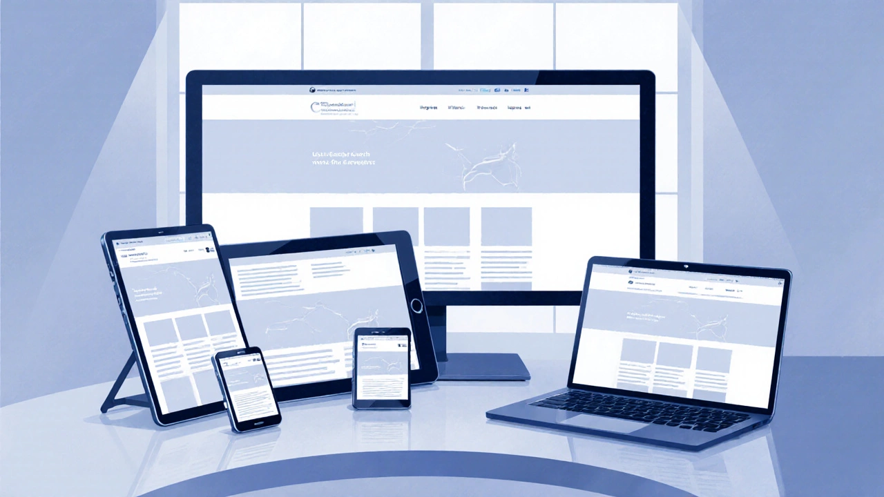
Why media queries matter for modern sites? They sit at the core of Responsive Web Design, the practice of building layouts that fluidly adapt to different devices. Together with CSS Breakpoints, specific pixel widths where the design switches layout, they define where content re‑flows. The Viewport, the meta tag that tells the browser how to scale the page works hand‑in‑hand with media queries to ensure the right styles hit the right device.
Mobile‑First, Breakpoint Planning, and Real‑World Tips
A mobile‑first strategy flips the usual order: you write the base CSS for the smallest screen, then add media queries as the viewport widens. This approach keeps the stylesheet lean and avoids overriding styles later. When picking breakpoints, think in terms of content, not device names—common values like 576 px, 768 px, 992 px, and 1200 px cover most phones, tablets, and laptops. Each CSS Breakpoint should correspond to a layout shift, such as moving from a single‑column stack to a two‑column grid.
Frameworks like Tailwind, Bootstrap, and newer CSS‑only tools bake sensible breakpoints into their utilities, letting you apply media‑query‑driven classes without writing raw queries. If you prefer a zero‑code solution, modern tools can generate responsive CSS automatically: they scan your design, suggest breakpoints, and output the necessary media query blocks. This automation saves time, but you still need to understand the underlying concepts to fine‑tune performance and avoid “one‑size‑fits‑all” bugs.
Common pitfalls include overloading a single media query with many unrelated rules, which hurts readability, and neglecting the orientation feature for tablets that rotate. Testing on real devices and using browser dev tools to emulate different viewports ensures your media queries behave as expected. Remember, media queries aren’t just about width; they can target prefers‑color‑scheme, hover, and even resolution for high‑DPI screens, expanding your design’s flexibility.
Below you’ll find a curated set of articles that dive deeper into each of these areas— from breakpoint best practices and automated responsiveness to choosing the right CSS language for fluid layouts. Explore the collection to see practical examples, step‑by‑step guides, and the latest trends shaping how developers use media queries in 2025 and beyond.
Oct
Bootstrap: Responsive or Adaptive? Explained
- Jaxon Millwater
- Responsive Web Design
- 0 comment
Discover whether Bootstrap is truly responsive or adaptive, learn its core grid and media query system, and see when to add adaptive tricks.
VIEW MOREOct
Responsive Web Design Theory Explained
- Jaxon Millwater
- Responsive Web Design
- 0 comment
Learn the core theory behind responsive web design, including fluid grids, flexible images, media queries, mobile‑first strategy, and practical best‑practice tips.
VIEW MORECategories
- Responsive Web Design (13)
- UX UI Design (12)
- Tech Careers (12)
- Web Development Courses (11)
- SEO for Web Developers (11)
- PHP Development (10)
- JavaScript (9)
- Ecommerce Websites (9)
- Web Development Frameworks (8)
- Front End Development (6)
Popular posts
-
Exploring What Comes After React: The Next Big Thing in Web Development
Jaxon Millwater -
Is Java Back-End? Demystifying Its True Role in Web Development
Jaxon Millwater -
Is CSS a Front End Language? Cutting Through the Confusion
Jaxon Millwater -
Can I Master Web Development in 3 Months?
Jaxon Millwater -
Java or PHP for Backend: Which Should You Learn First?
Jaxon Millwater