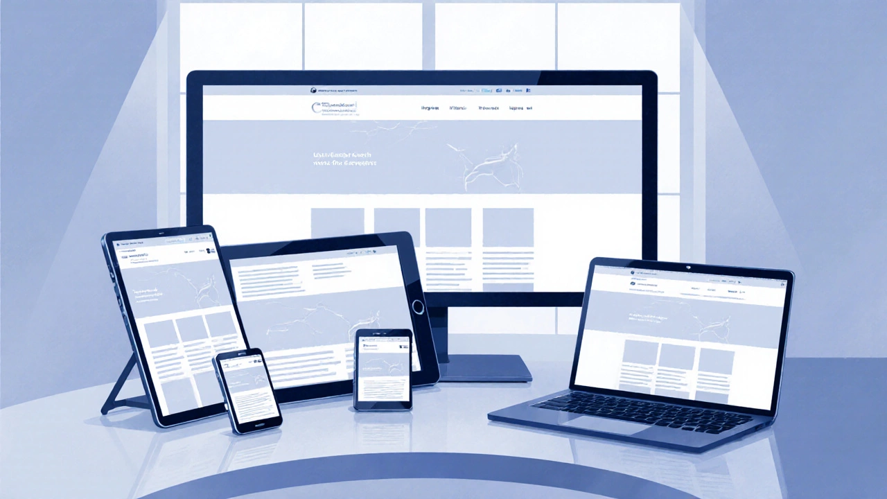
Responsive Design Demo
Responsive Layout Preview
How This Demonstrates Responsive Design
- Fluid Grid: The boxes automatically resize and reposition based on available space
- Flexible Content: The layout adapts to different screen sizes without breaking
- Media Queries: Different behaviors are applied based on viewport width
- Mobile-First: Base styles work on small screens, enhanced for larger ones
Try adjusting the viewport width slider to see how the layout changes at different screen sizes!
When you hear the term Responsive Web Design is a design approach that makes web pages adapt smoothly to different screen sizes, orientations, and resolutions, you’re looking at a set of techniques that keep layouts usable from a smartwatch to a 4K monitor.
Core Principles of Responsive Web Design
At its heart, responsive design rests on three pillars: fluid grids that resize proportionally, flexible images that scale with the viewport, and media queries that let CSS react to device characteristics. Together they replace the old "one‑size‑fits‑all" mindset with a dynamic flow that feels natural on any device.
Fluid Grids Explained
Fluid grids are layouts built on relative units, typically percentages, rather than fixed pixel values. By defining column widths as a fraction of the total width, the grid stretches or shrinks as the browser window changes. For example, a three‑column layout might allocate 33.33% to each column, leaving no gaps when the screen widens or narrows.
Modern CSS offers grid-template-columns: repeat(12, 1fr); which creates a 12‑column fluid system where 1fr represents a flexible fraction of space. Combining this with gap ensures consistent spacing without hard‑coded margins.
Flexible Images and Media
Images that ignore the viewport can break layouts, causing horizontal scrollbars or clipped content. The viewport meta tag tells browsers how to scale the page on mobile devices is the first line of defense. Adding <meta name="viewport" content="width=device-width, initial-scale=1"> makes the CSS pixel grid match the device’s width.
From there, CSS rules like img { max-width: 100%; height: auto; } ensure images never exceed their container’s width. For videos, the iframe trick using a wrapper with position: relative; padding-bottom: 56.25%; preserves the aspect ratio while letting the player resize.
Media Queries and Breakpoints
Media queries are conditional CSS blocks that apply styles when certain conditions are met, most commonly the viewport width.
Typical breakpoints follow common device widths: 320px for phones, 768px for tablets, 1024px for small laptops, and 1440px for large desktops. A practical example:
@media (max-width: 768px) {
  .sidebar { display: none; }
  .main { width: 100%; }
}
These queries let you rearrange navigation, hide sidebars, or switch to a single‑column layout when space is limited.
Mobile‑First Approach
Designing "mobile‑first" means writing the default CSS for the smallest screens, then layering larger‑screen enhancements inside media queries. This strategy avoids bulky overrides and forces you to prioritize essential content.
Performance gains appear because mobile browsers download only the base CSS initially; additional rules are parsed later as needed. Google’s Core Web Vitals reward such efficient loading, reinforcing the mobile‑first ethos.
Best‑Practice Checklist
- Start with
<meta name="viewport">in the<head>. - Build layouts on a fluid grid, using percentages or
frunits. - Make all media flexible:
max-width: 100%; height: auto;. - Define clear breakpoints that match your content, not just device sizes.
- Write base styles for the smallest screen, then expand with media queries.
- Test with real devices and browser dev tools - emulate varied DPR (device pixel ratio) values.
- Leverage progressive enhancement to add features that older browsers can safely ignore.

Common Pitfalls to Avoid
1. Using fixed widths for containers - they lock the layout and cause overflow.
2. Ignoring device pixel ratio which can make images look blurry on high‑DPI screens. Serve @2x assets when needed.
3. Over‑loading breakpoints - too many media queries make maintenance a nightmare. Stick to 3‑5 logical thresholds.
4. Forgetting to test orientation changes - a layout that works in portrait may break in landscape if width‑only queries are used.
Quick Reference Table
| Technique | Purpose | Typical Implementation |
|---|---|---|
| Fluid Grids | Scale layout proportionally | CSS Grid with fr units or percentage columns |
| Flexible Images | Prevent overflow on small screens | img { max-width:100%; height:auto; } |
| Media Queries | Apply style rules at specific breakpoints | @media (min-width: 768px) { … } |
| Viewport Meta Tag | Tell browsers how to size the page | <meta name="viewport" content="width=device-width, initial-scale=1"> |
| Mobile‑First | Prioritize essential content and performance | Write base CSS for max-width: 480px, then expand |
Frequently Asked Questions
Is responsive design the same as adaptive design?
No. Responsive design relies on fluid grids and media queries to adjust continuously, while adaptive design serves distinct fixed layouts for predefined screen buckets.
Do I need JavaScript for a responsive site?
JavaScript isn’t required for basic responsiveness. CSS alone handles fluid grids, flexible media, and media queries. JavaScript can enhance interaction (e.g., toggling menus) but should not be the sole means of layout changes.
How many breakpoints should I use?
Aim for 3‑5 logical breakpoints that correspond to major content shifts, not every possible device width. Common values are 480px, 768px, 1024px, and 1440px.
What’s the role of progressive enhancement in responsive design?
It ensures core functionality works on all browsers, then layers richer features (like CSS Grid or advanced media queries) for browsers that support them, keeping the experience graceful across the board.
Can responsive design improve SEO?
Absolutely. Google prefers a single URL serving all devices, avoiding duplicate content issues that arise with separate mobile sites. Fast, mobile‑friendly pages also rank higher in mobile search results.