Breakpoints in Web Design: Why They Matter and How to Use Them
When working with breakpoints, specific screen‑width thresholds that trigger layout changes in responsive design. Also known as responsive breakpoints, they let a site swap grids, fonts, and images so it looks good on a desktop, a tablet, or a phone.
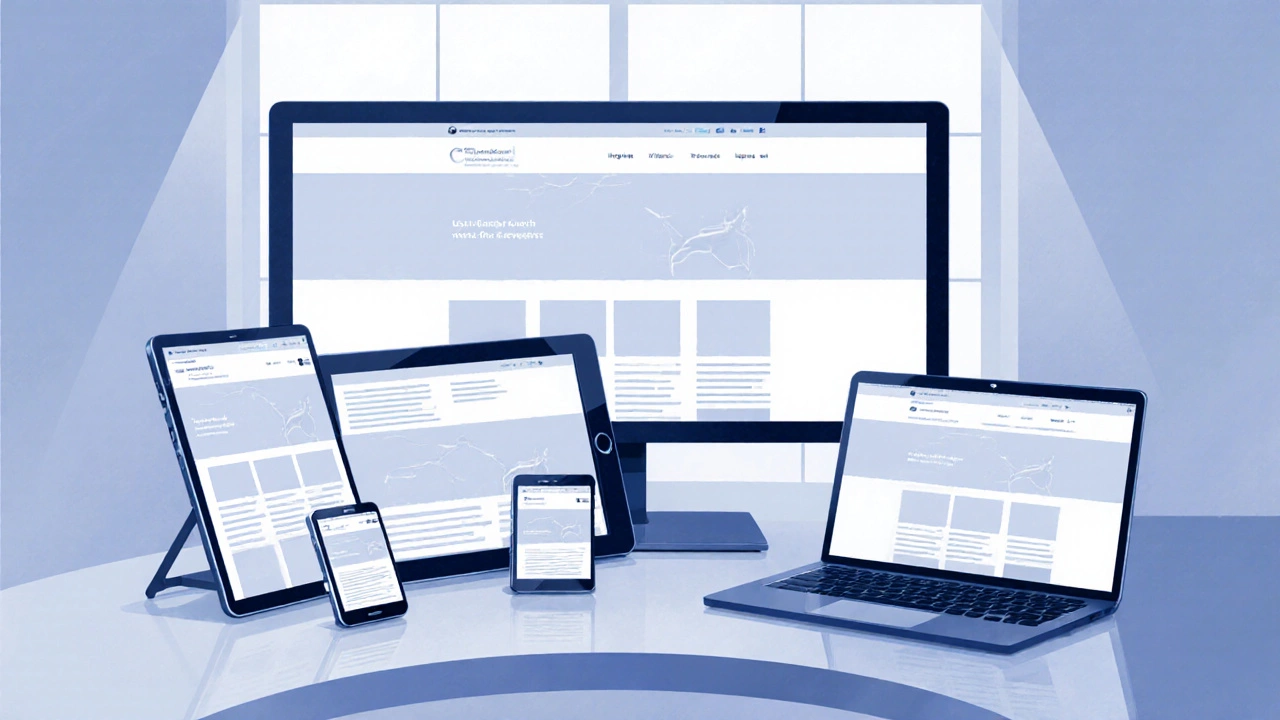
Every Responsive Web Design, a strategy that makes web pages adapt fluidly to any viewport relies on breakpoints to decide when to switch from a multi‑column layout to a single‑column stack. The magic happens through Media Queries, CSS rules that apply styles only when certain conditions like width are met. In practice, you write a query such as @media (max-width: 768px) and tie it to a breakpoint that defines the tablet view. This simple pattern is the backbone of most modern sites.
How Breakpoints Connect to Adaptive Design and Frameworks
Adaptive Design, an approach that serves distinct layouts for predefined device categories takes breakpoints a step further. Instead of fluidly resizing every element, adaptive sites load a whole layout that matches the nearest breakpoint. That means faster load times on low‑end devices and tighter control over visual fidelity. Many designers blend adaptive and responsive techniques, using a core set of breakpoints and then tweaking specific sections with custom queries.
Frameworks like Bootstrap, a popular CSS library with a built‑in grid system and ready‑made breakpoints simplify the whole process. Bootstrap defines five default breakpoints (xs, sm, md, lg, xl) that map to common device widths. When you add col‑md‑6 to a div, you’re telling the grid to occupy half the screen starting at the medium breakpoint (≈768 px). You can override these values or add new ones, giving you full control while still benefiting from the library’s consistency.
Beyond frameworks, modern tools such as CSS Grid and Flexbox let you craft custom breakpoint ranges without a heavyweight library. With Grid you can declare grid-template-columns: repeat(auto-fill, minmax(200px, 1fr)) and let the browser automatically create columns that respect your minimum width—a kind of fluid breakpoint. Flexbox, on the other hand, lets items wrap or stay in a row based on the available space, which is essentially a breakpoint in disguise.
Understanding breakpoints also helps you avoid common pitfalls. Setting too many breakpoints creates a maintenance nightmare; too few, and your design looks stretched on midsize screens. A good rule of thumb is to start with the three classic breakpoints—mobile (≤ 576 px), tablet (≈ 768 px), desktop (≥ 992 px)—and add or remove as user data dictates. Tools like Chrome DevTools let you test breakpoints in real time, and you can save custom device profiles for future projects.
Our article collection below dives deep into each of these topics. You’ll find hands‑on guides on building a responsive grid with Bootstrap, step‑by‑step tutorials for writing media queries, and strategic advice on when to choose adaptive over fully responsive layouts. Whether you’re a UI/UX designer fine‑tuning wireframes or a developer polishing a production site, the posts will give you concrete steps to master breakpoints and deliver smooth experiences across every device.
Oct
Responsive Web Design Theory Explained
- Jaxon Millwater
- Responsive Web Design
- 0 comment
Learn the core theory behind responsive web design, including fluid grids, flexible images, media queries, mobile‑first strategy, and practical best‑practice tips.
VIEW MOREJul

Best Breakpoint Sizes for Responsive Web Design in 2025
- Jaxon Millwater
- Responsive Web Design
- 0 comment
Wondering what size works best for responsive web design? Find up-to-date, practical advice, breakpoints, and key strategies to make your website look great on any device.
VIEW MORECategories
- Responsive Web Design (13)
- UX UI Design (12)
- Tech Careers (12)
- Web Development Courses (11)
- SEO for Web Developers (11)
- PHP Development (10)
- JavaScript (9)
- Ecommerce Websites (9)
- Web Development Frameworks (8)
- Front End Development (6)
Popular posts
-
Does Being a Web Developer Pay Well?
Jaxon Millwater -
Python vs JavaScript: Which Is Easier to Learn?
Jaxon Millwater -
Can You Get Into UX Design With No Experience? 2025 Beginner’s Guide to Your First Job
Jaxon Millwater -
C++ vs PHP: Key Similarities and Differences in Modern Programming
Jaxon Millwater -
Python vs PHP Speed: Which Is Faster for Web Development?
Jaxon Millwater